Sunday, March 10, 2013

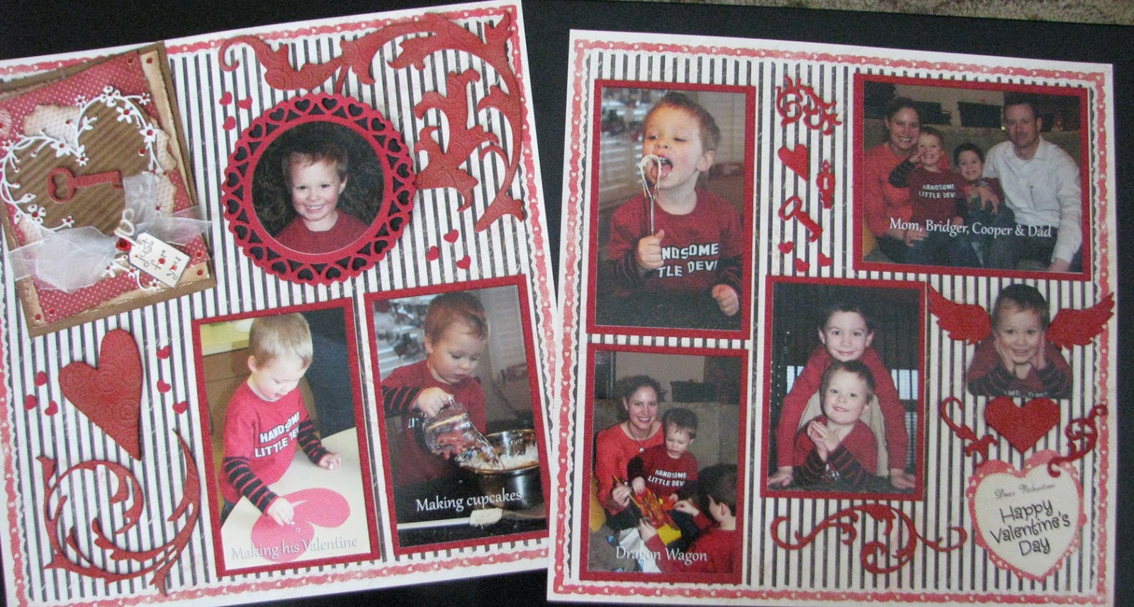
Numbers Valentine Card


The Sizzix Tim Holtz Texture Fades Embossing Bingo Folder was my inspiration for this challenge.

Challenges:
Simon Says Stamp and Show: By the Numbers
Sunday, March 3, 2013

With Love Scrapbooking Layout

The Simon Says Challenge is "the stamp you love (but don't use)...

My entry for the challenge includes two stamps that I never seem to use but worked perfect for my scrapbook layout. Here's the layout then I'll show you closeups of the stamps.


I made the corner embellishment first and yes, I know it looks like a card, but it doesn't open and is simply an embellishment. The tiny stamp "Just for You" is tied to the bow. It is about the size of an A2 card if you wanted to make a similar card. There are lots of layers in this element.


The second stamp was one I found in my container of stamps, it's a Hero Art stamp and perfect for the layout.

You know how you dig through your stash and just seem to find the perfect elements. Guess it pays to dig! I found all the Tim Holtz Grungeboard pieces used on the layout in a sack in my stash. They were then stained with Distress Stains and adhered to the pages. 

Other elements:
·        Spellbinders Nestabilities Decorative Elements Heart Circle and Standard Circle
·        Memory Box Bingham Heart and Grand Heart

Paper is *Authentique 12 x 12 LOVELY Paper & Stickers LOV010

Challenges:
Simon Says Challenge: the stamp you love (but don't use) . . 
Layer it On and Share A Word at Frilly and Funkie
Anything Goes at Simon Says Stamp Challenge

Friday, February 1, 2013

Seeing Stars Scrapbooking Layout

The inspiration for my Seeing Stars theme came from the stars I was using on my grandson's scrapbook layouts for his soccer and T ball pages. 

I used the Sizzix Stars #2 die to cut the large, medium and small stars for the layouts.

The star border was cut using a svg file with the Sure Cuts A Lot program. 

Lots of fun memories were created when this "little star" played soccer and T-ball over the summer.

Challenge:
Simon Says Stamp and Show: Seeing Stars


Saturday, November 10, 2012

Les Miserables Papercrafting Project


When I think of France, the famous French novel “Les Misérables” by author Victor Hugo instantly comes to mind. I saw the musical at the Music Hall in Kansas City and truly loved it and of course shed tears throughout, but I am a softy.  Here's my stage and sign for the musical.


The novel is considered to be one of the greatest novels of the nineteenth century and follows the lives and interactions of many characters. The character in the novel and musical I am focusing on is Cosette, whose story is quite moving.


I printed a portrait of "Cosette" by Emile Bayard, from the original edition of Les Misérables (1862) on an ink jet printer. Cosette is a fictional character in the novel whose mother, Fantine,  places her under the guardianship of the Thénardiers, where she is severely mistreated.

You may want to read the novel or see the musical to follow the life of Cosette.

http://en.wikipedia.org/wiki/File:Ebcosette.jpg

I added some stains to the image for contrast, on the wooden door I used Vintage Photo, on the stones - Pumice Stone; on Colette - a little Barn Door on her hair; and on the water - a little Glossy Accent was added for shine on the water highlights.


I wanted to make a stage and a Honey Maid Graham Cracker box was the beginning of my stage.

I cut the front panel of the box to open it up like a stage and began staining it with Black Soot. It took several coats of the Black Soot.


For stage curtains, I started with white lace ribbons stained then thought I wanted red curtains so stained the lace with Barn Door Distress Stain. 


My first assembly came together pretty well but I wanted a Broadway type sign on top so wanted to add some lighting on the sign. 


I made a a sign for the top of the stage to resemble a Broardway sign and used dew drops for the lighting effect.


Now it was time to create a small sign to sit in front of the stage promoting Les Miserables. I used a Sizzix Nestabilities die to cut the small sign and stamped with a Hero Arts stamp repeatedly, added a fleur de lis, a ticket, some script, Tattered Banner. distress ink and a picture of Cosette from the musical.


There you have it, my stage and signs are complete - Judy.

Challenge:
Simon Says Stamp and Show: Inspiration Francaise

Saturday, November 3, 2012

Remembering Family Scrapbook Layout

Today's post is all about family, pearls, flowers, and pastels. So expect to see a lot of each. This page will become part of an album honoring my parents and grandparents. The paper is by K&Company and seems so perfect for a bit of nostalgia. 


 I toned down the white streaming ribbons with a few swipes of Old Paper Distress Ink then tied the ribbon in a bow and trimmed the streamers to fit the space.
The flowers were white and I wanted to make them a shade of pastel pink by first inking them with a tiny bit with Old Paper for a little shading then inking again with Angel Pink Memento Ink.

I also sprayed the flowers with Perfect Pearls - Pearl for some added shine and glimmer.

As I was inking the flowers I remembered some pink ribbon roses  that I used over twenty years ago and thought they were in my sewing chest. I had stitched the three roses together and added the green ribbon stems for a project years ago. 


There was only one issue, the roses were a much brighter shade of pink, too bright for this pastel project. 

To solve the issue, I first dabbed on Picket Fence Distress Stain. Wow, it worked and my roses were a much softer pink! I followed by adding a little Pearl Paint using an Adirondack Paint Dabber and was pleased with my results.


While digging in my sewing chest, I saw some straight pins that had white heads and knew I wanted to add a few to the roses and stems.

Three pins were added to keep it an odd number.
The pearls for the flower centers is White Opal Liquid Pearls by Ranger. I could have used stick on pearls but I enjoy squeezing the bottle and making my own.

I used the same technique for the pearls on the ribbons. Now my project needed to dry for a while since the Liquid Pearls can be smudged very quickly with the slightest touch of a finger.

The K& Company paper had a small vine running around the border which gave me an idea to add pearls along the vine. Here I decided to used stick on pearls so I would not have to worry about smudging the pearls as I was working.

There you have it, this page is complete and ready for the album. Thanks for stopping by - Judy.

Challenges:
Simon Says Stamp and Show Challenge: Just Add Pearl
Fussy and Fancy Friday Challenge: Pearls and Flowers

Friday, November 2, 2012

Christmas Pearls Card

Working with pearls, how elegant is that? The Simon Says Stamp Challenge: Just Add Pearl gave me the chance to work with Perfect Pearls Mist, TH - The Snowflake Rosette, a Nestabilities Label and lots of stick on pearls. This week's challenge at Joan's Garden is "A Winter Card" so great, I can enter both challenges with this card. 


I want to make use of the cutout piece from the Spellbinders Nestabilities Label so I made a second card. I wish you could see the Shimmer on the white paper and the blue paper. They add so much sparkle to the paper.


Supplies:
Tim Holtz Alterations: Tattered Banners and Snowflake Rosette
Ranger - Perfect Pearls Mists: Perfect Pearl and Heirloom Gold

Paper:
White Shimmer by TPC Studio
Ice Blue Metallic by The Paper Company

Spellbinders Nestabilities - Labels 18

Crystal Stickers - Pearls Perles

Silver Elastic Cord

Saturday, October 27, 2012

Make It Merry Card - Wendy Vecchi

The challenge for the week at Simon Says Stamp and Show is Inspired by Wendy Vecchi. I am very last minute getting an entry for the challenge because I haven't been home all week but I am finished just in time.

My entry is a Christmas card make using the stamp: Art of Making It Pretty LCS007. Take a look:


The stamp set has five different rubber stamps and between the outside and inside of the card, I managed to use all of them. My card began with vanilla card stock, then inked the background stamp in the set with Old Paper Distress Ink to keep the background light. I heat dried it a few seconds, then inked the poinsettia stamp with Forrest Moss Distress Ink and stamped over the background. Next I inked some red paper with Barn Door Distress Ink to get a little deeper red. On the poinsettia stamp I used the Ranger Emboss It Clear Ink Pad and Ranger Red Embossing Tinsel then heat dried it then cut it out and used double sided sticky foam squares to attach the poinsettia. I inked the edges of the card with Old Paper to stay with that subtle look then used Gold Stickles on the center of the poinsettia and Lime Green Stickles on the swirls of the flower.

I used a piece of the cardstock that had been stamped with the background stamp while I was practicing to stamp "make it Merry." I inked with Ranger Emboss It Clear Ink Pad and Ranger Red Embossing Tinsel then heat dried it then cut it out and used double sided sticky foam squares to attach it to the front of the card.