My project began with the selection of a Blue Fern Frame and the idea of using color. Here's a peek at my finished project then I show you the steps.

 I selected the Blue Fern frame which is an approximate 10" square frame and is all one piece. The frame has beautiful details which you can see in the picture.

I was so excited to start applying color to the frame and nothing better than using Tim Holtz Distress Paints and Adirondack Acrylic Paint. I plan to use Brushed Pewter, Cloudy Blue and Pearl. We'll come back to the frame in a minute.

As I took the frame out of
the package I saw that the package included a piece of printed paper that had a beautiful lattice background. I liked it and again thought I could apply some dabs of paint here and there and give it a little different look. My pictures shows the paper after I dabbed Brushed Pewter Distress Paint, Mustard Seed Distress Paint and the Cloudy Blue Paint. I dried the paint with a heat tool.
 Next I started working on the frame with the Brushed Pewter, Cloudy Blue and the Pearl paints. I dabbed the Pewter right on the chipboard frame then dried it a little. Next I dabbed the Cloudy Blue and finally the Pearl with a little drying between each color. I hope you can see the effect of the three paints in the picture.
 I used Glue Dots
to adhere the frame to the paper and only on the sides and bottom. I knew I wanted to add a picture in the frame later.
Now let's talk about the flowers:

I used Prima flowers that were bright purple and lime green colors and toned them down with the Tim Holtz and Adirondack paints.
 They hardly look like the same flowers, it's fascinating to see what the paint can do. Endless possibilities with the paint combos.
 I applied Mustard Seed Paint, wiped a little off and let it dry plus used the heat tool just a little. Then dabbed a little of the same color on a tissue swiped over the butterfly lightly and hoping the raised swirls on the butterfly would be highlighted. I used a couple pieces of bling for the butterfly body. I made some antennas for the butterfly out of wire but didn't get a picture of them.
 Time to add the flowers and bling to the paper and the frame.
I just love the look of the flowers with the extra dabs of Pearl paint on the edges.
 After I used the Mustard Seed Paint on the butterflies, I dabbed a little more of it on the background paper for a little more emphasis.

Now you have it all, step-by-step and I can't tell you how happy I am with the finished product. I plan to add a picture and use it in a frame and oh what fun it was to play with color.
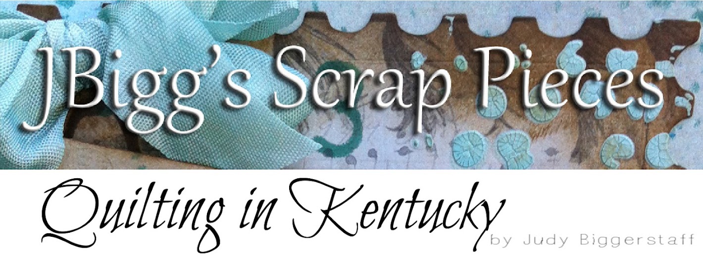
I took a pic of the top portion of the project and made a new header with it in Photoshop.
Thanks for stopping by - Judy.
Challenges:
Simon Says Stamp & Show: Color Challenge


 I selected the Blue Fern frame which is an approximate 10" square frame and is all one piece. The frame has beautiful details which you can see in the picture.
I was so excited to start applying color to the frame and nothing better than using Tim Holtz Distress Paints and Adirondack Acrylic Paint. I plan to use Brushed Pewter, Cloudy Blue and Pearl. We'll come back to the frame in a minute.

the package I saw that the package included a piece of printed paper that had a beautiful lattice background. I liked it and again thought I could apply some dabs of paint here and there and give it a little different look. My pictures shows the paper after I dabbed Brushed Pewter Distress Paint, Mustard Seed Distress Paint and the Cloudy Blue Paint. I dried the paint with a heat tool.
 Next I started working on the frame with the Brushed Pewter, Cloudy Blue and the Pearl paints. I dabbed the Pewter right on the chipboard frame then dried it a little. Next I dabbed the Cloudy Blue and finally the Pearl with a little drying between each color. I hope you can see the effect of the three paints in the picture.
 I used Glue Dots
 to adhere the frame to the paper and only on the sides and bottom. I knew I wanted to add a picture in the frame later.
Now let's talk about the flowers:

I used Prima flowers that were bright purple and lime green colors and toned them down with the Tim Holtz and Adirondack paints.
 They hardly look like the same flowers, it's fascinating to see what the paint can do. Endless possibilities with the paint combos.
The butterfly pieces are Tim Holtz chipboard.
 I applied Mustard Seed Paint, wiped a little off and let it dry plus used the heat tool just a little. Then dabbed a little of the same color on a tissue swiped over the butterfly lightly and hoping the raised swirls on the butterfly would be highlighted. I used a couple pieces of bling for the butterfly body. I made some antennas for the butterfly out of wire but didn't get a picture of them.
  Time to add the flowers and bling to the paper and the frame.
 I just love the look of the flowers with the extra dabs of Pearl paint on the edges.
 After I used the Mustard Seed Paint on the butterflies, I dabbed a little more of it on the background paper for a little more emphasis.
Now you have it all, step-by-step and I can't tell you how happy I am with the finished product. I plan to add a picture and use it in a frame and oh what fun it was to play with color.
I took a pic of the top portion of the project and made a new header with it in Photoshop.
Thanks for stopping by - Judy.
Challenges:
Simon Says Stamp & Show: Color Challenge


